(Cc)hildish
(Bb)ooks

Betty Art Book Fair
Childish Books Round Up
Website live through Dec 22nd ︎ www.thebettys.com
by Hannah Coleman
December 20th 2020:
December 20th 2020:
We have been looking forward to the Betty Art Book Fair for months. As an event that centers zines and radical fun, we knew it would be right up our alley. The fair is the culminating project of The Bettys, an innovative art community concept founded by Salvadoran-American Aurora Diaz in 2014.
The gorgeous and colorful website, built by Lucky Risograph, features four explorable “rooms” to discover the fair’s twenty one vendors. We have had the pleasure of browsing the site to bring you our Childish picks below.

1. Be The Change! A Justseeds Coloring Book
Just Seeds Artist Collective
Published by Radix Media
Room 1
This coloring book includes artwork from
the Justseeds Artists’ Cooperative, a decentralized network of 41 artists committed to social, environmental, and political engagement.
Intended for people of all ages, it hopes to invite slowness and celebration through artmaking. “Make the revolution bright, colorful, and irresistible! Together we can be the change we want to see!”

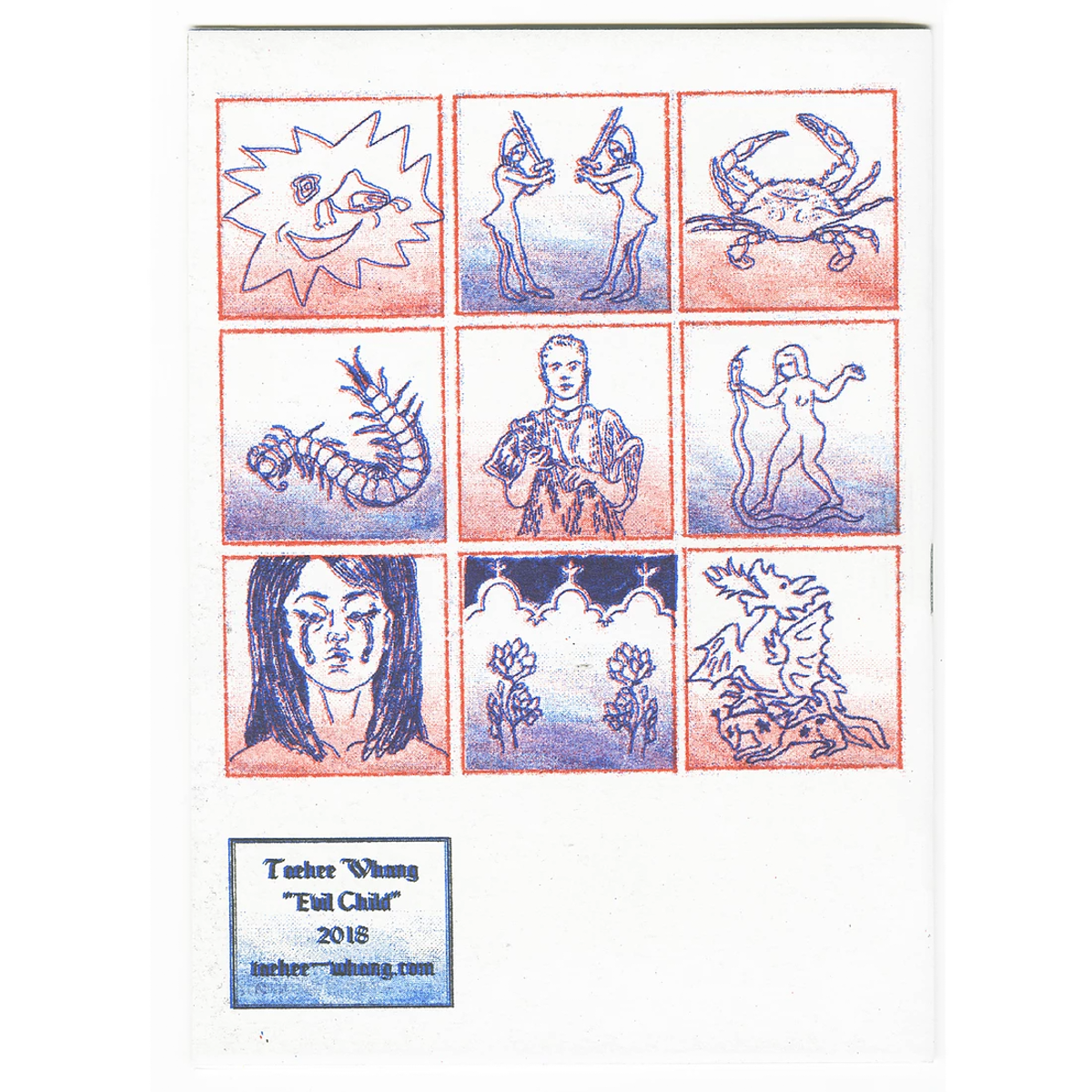
2. Evil Child
Taehee Whang
Published by Hyperlink Press
Room 1
We are excited to read this 2018 title, by Korean-American interdisciplinary artist Taehee Whang. The book is described as weaving folktales of changelings with Whang’s own childhood internet experiences, navigating a “certain queer anxiety.”
Taehee Whang
Published by Hyperlink Press
Room 1
We are excited to read this 2018 title, by Korean-American interdisciplinary artist Taehee Whang. The book is described as weaving folktales of changelings with Whang’s own childhood internet experiences, navigating a “certain queer anxiety.”
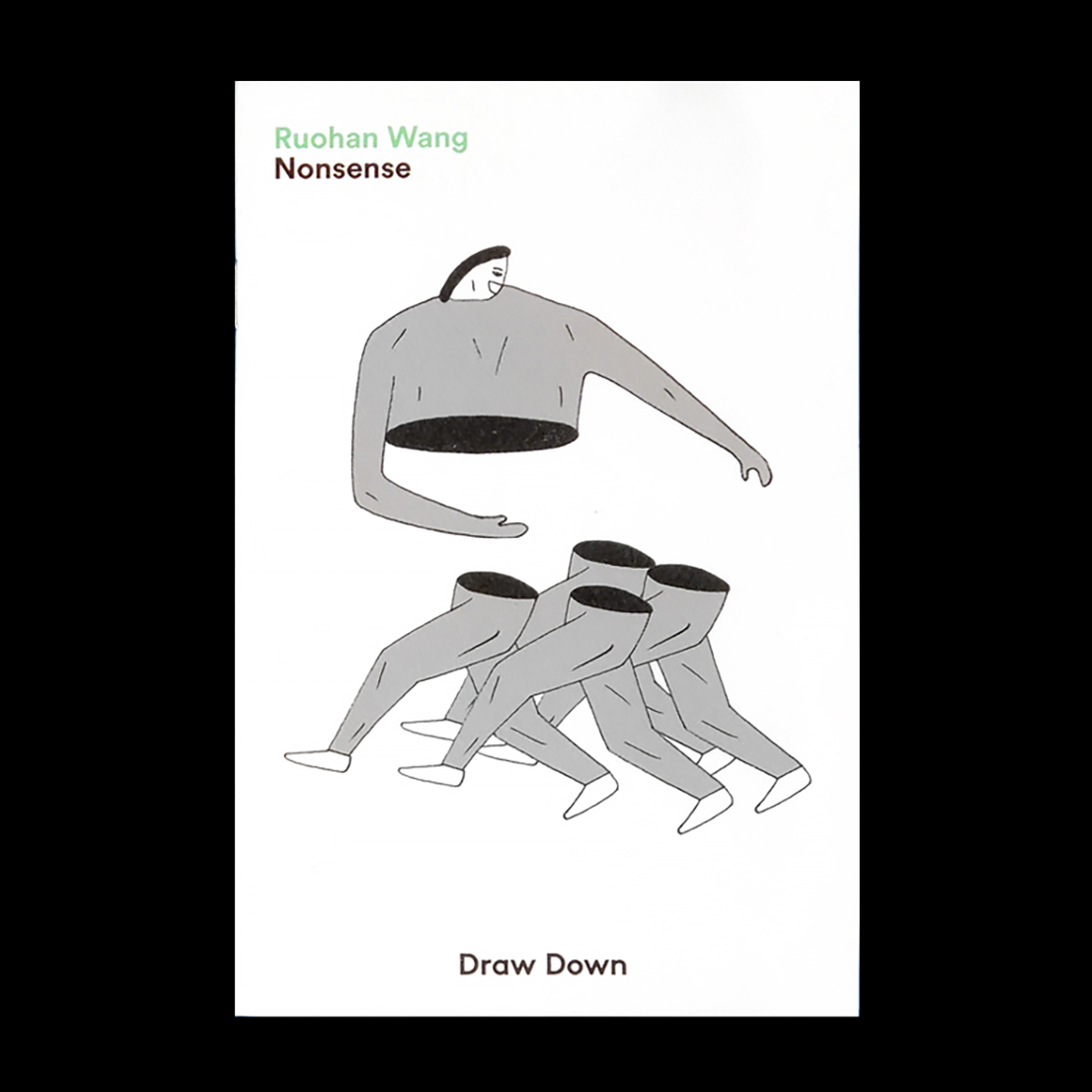
3. Nonsense
Ruohan Wang
Published by Draw Down
Room 1
We love the small and easy to handle formats of Draw Down Books. They are great for little hands, and at $5, you don’t have to worry if it sees a lot of use and love. Nonsense looks full of visual delight, utilizing analog and digital image making techniques, Wang reflects “the small, simple, and nonsensical moments of life.”
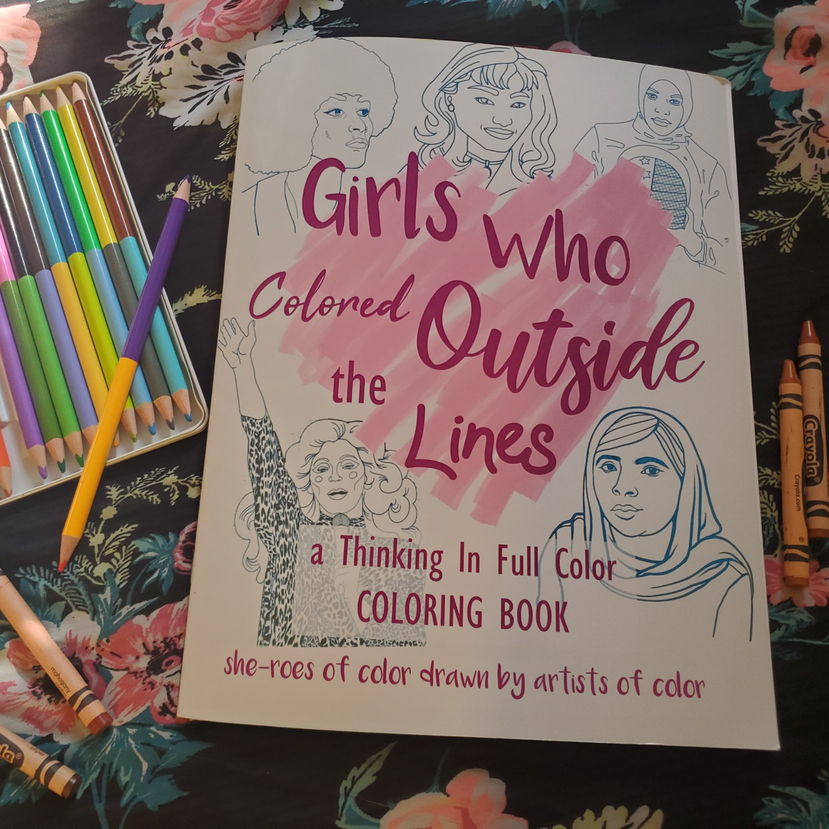
4. Girls Who Colored Outside the Lines
Summer Dawn Reyes
Nerissa Tutiven
Emily Mun
ArtisticAfro (Hiyasmine Gaskins)
Vanessa Velez
Nala Wu
Published by In Full Color
Room 1
Designed for young girls of color, Girls Who Colored Outside the Lines recognizes the difficulty for nonmajoritarian children to find and learn about historical narratives and voices who represent and reflect their own experiences. The dozens of stories include figures like Maya Angelou, Pura Belpré, Angela Davis, Katherine Johnson, Rita Moreno, Ibtihaj Muhammad, Mithali Raj, Naoko Takeuchi, Kara Walker, Anna May Wong, Holly Woodlawn, and Malala Yousafzai. We love that it also represents a variety of living artists, through illustrations by five womxn of color.
5. A Sashimi Zine
Decue Wu
Published by In Full Color
Room 2
It was hard to pick just one Little Mountain Press book, as they have many great books at the fair for any Childish readers - be sure to check out all their titles. We choose to feature A Sashimi Zine because we love classic zines that take up everyday life, in this case the author’s adorable cat. The simplicity of line beautifully renders a circular sleeping white cat, and we can’t wait to see the rest!
6. Earth Witch Affirmations
Cenorina Ramirez
Published by Mi Casita Press
Room 1
We could all use some grounding affirmations this year, as well as a journal to write it all down in. We love the simple illustraions and meaningful handwritten text with phrases includin “anything lost will be replaced by something more profound”.

7. the artsy-craftsy-creative bundle :)
sabrina s
Published by Starly Art Studio
Room 2
If you are looking for a great value, this bundle delivers five zines for just $10! The collection hasmuch to offer for Childish readers: Emotions Are Weird explores lifes harder to describe feelings “like mush - when you have too many feelings at once and just can't rn”. So You Want to Make a Zine? looks great for beginner book makers, and if you’re worried about making your first zine just read Artist Insecurities to find support about dealing with imposter fears in the arts.

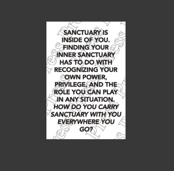
8. Sanctuary Manifesto
Press Press
Published by Press Press
Room 4
Looking for art for a nursery, classroom, or any other type of childish santuary? Check out this incredible manifesto made by publishing initiative Press Press in collaboration with immigrant and immigrant-adjacent voices to question the concept of sanctuary “—what is it, how can it be created, and in turn, also protected?” We wish this adorned our childhood walls and minds, to soak up everyday as we grew. (Luckily we ordered one and plan to do so as we continue to grow up).
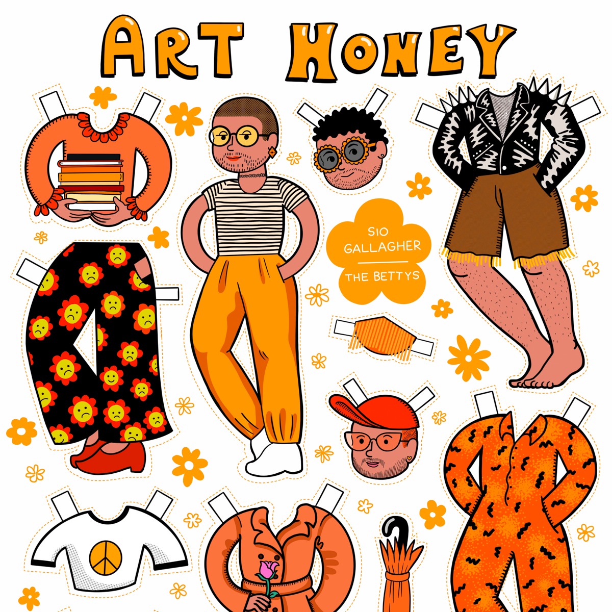
9. The Bettys Paper Dolls
Siobhan Gallagher
Published by The Bettys
Room 4
Last but not least we are *in love* with these Art Angel, Art Honey, and Art Hustler paper dolls, complete with face mask, fleetwood mac shirt, body hair, and fresh ink. Swoon.
More about The Bettys, from the fair website:
The Bettys has been an outlet for authentic and experimental creative environments. The Bettys has shown at multiple art book|zine fairs across of America, distributing, and collaborating with emerging artists whose intersections make it harder to be in the rich cis-man's world more commonly referred to as ‘The Art World.'
www.thebettys.com
© All Copyrights to the listed artists
Moments— Anna Sellheim
Self Published 2018 ︎ See Artist’s Website
Review by Hannah Coleman:
A dog curls up in a ball. A person nods along to music from their headphones. Someone lets out a big laugh. Moments, this low-key sixteen page zine is a celebration of quiet instances of intimacy. On each page Anna Sellheim draws in a four panel comic format to wordlessly capture these small slices of life. The script on the title page, which looks to be written in colored pencil or crayon, reinforces the book’s theme by lending a hand touched feel. This quality carries throughout the waxy, full color illustrations which flow easefully together. The pacing and subtle detail encourage endless enjoyabale re-readings.
While a couple of the vignettes illustrate acts that readers might expect to find in such a series (holding hands, and waking up in the middle of a night to touch a co-sleeper’s shoulder) most of the comics subtly push typical portrayals of intimacy. Whereas closeness tends to be presented as something shared in a couple, the vast majority of the drawings portray solo people having an intimate moment alone; a person satisfaction’s when putting on a bright lipstick. Tucking hair behind an ear as it blows in the wind. Even a dog curling up in a ball on the floor is thrown in the mix, suggesting we expand our thinking beyond the human. Pushing convention further, not all the moments were warm and fuzzy, perhaps hinting that being vulnerable and open can equally lead to intimate feelings of pain. In this sequence, the zine includes a surprised eye roll and hanging up on a phone call in frustration. Sellheim elevates these experiences as equal with the rest by including them throughout. While both coupled, solo, non-human, and difficult moments are shown experience by a range of beings, I was surprised not to find any portrayals of group or community based intimacy present. This aside, it was great that intimacy is not framed as something sexual or even necessarily physical, making this piece a wonderful choice for Asexual spectrum readers.
Link to Purchase
© All Copyrights to the artist, Anna Sellheim
16 page
Staple Bound
Full color
United States
2018
No visible ISBN
5.5 x 8.5 inches


Do You Want us Here or Not?
— Shannon Finnegan
Self Published 2017 ︎ See Artist’s Website
Interview by Hannah Coleman
with Shannon Finnegan
December of 2019:
with Shannon Finnegan
December of 2019:
H: Well, I think a great place to start would be, when and how did you learn about zine making?
S: I grew up in the Bay area and zines were just kind of like, around. Then in college, I studied printmaking and book making, but then I think I realized that I don’t always want a super high level of preciousness and craft around things and so then kind of looked towards zine making as a model for what that is. I am a little ambivalent about the term. I don’t think I understand the term zines super well. My friend Breanne Trammell was talking to me about like zines as counter cultural, and so when she does zine making with her students she gives them the option of calling it a zine or a booklet. So, for me, depending on the project some feel more like booklets, though this one feels a bit more like a zine.
H: Yeah absolutely, and that all leads perfectly to my next question, which is, can you talk about the genesis of Do You Even Want Us Here? And perhaps why you choose to make it in this format?
S: So the project comes from my experience of museums, I feel like those are really hard spaces for my body and the project was kinda sparked by a particularly egregious visit to MoMa in New York. Where really, it’s silly how few benches there were there. When I first thought of the idea I just had all these drawings, and those felt like a really good way of communicating what I was talking about. I’ve since made physical benches but I think at the time I was just like the drawings really captures this pretty well so how can I circulate this idea, or set of ideas. And I love those one page zines because they’re so easy to make and mail and so I just made a bunch of them in order to kind of mark that idea. Then I was able to send them out to people, and give them to friends, so I felt very loose about tossing them out into the world.
H: I remember you maybe posted about it on your instagram too, and so you kind of used your personal community to circulate it. Is that largely how you got them out?
S: Yeah, I don’t have any official distribution channels, and also, I love mailing things. I made it as a way of marking the idea and then I knew I just wanted people to have them and that felt like the easiest way to just kinda like get them out there.
And yeah, I think also, thinking about friends, or acquaintances who work in museum spaces - I was also thinking about it as a potential resources for them. My friend Hallie had it up in her office when I visited her at the Getty, so thinking about how it might also support people who are already trying to do that [accessibility] work within those spaces.
H: Totally. You have since made a second zine in this series - can you talk a bit about that second edition?
S: Yes, so from thinking about museum spaces I just started to think more about moving through the city. Subway spaces, the way that street spaces and parks are designed. And those are often very hostile environments, obviously like connected to policies to discourage people who are homeless - and I don’t know as much about that dimension of it, but it feels like a very classed and racialized set of policies. I definitely notice it in the city when I move through wealthier neighborhoods there’s more seating for sitting and rest, but also those are sometimes highly monitored. Anyway, I found myself thinking about the importance of having space to rest in the city, again, rooted in my own embodied experience of like, when I can sit on the subway platform, that makes a big difference in my day. And realizing that some of the things I had been thinking about in museum spaces also make sense in a city context. So I began generating new text around that, so like one of the ones in the second edition is like “it was hard to get here, sit if you agree” or “my commute involves too much standing, sit if you agree.” It was a way of iterating the project and thinking through what a set of those benches might look like for a city space.
H: You’ve since made a couple physical versions and sculptures of these original drawings, I was wondering if you’ve ever had any children interact with these works - or how you think children might engage with the work that you’re making?
S: I can’t say that I can have of any specific experience thinking about my work in relation to kids as an audience, but I do think in my work I try to be pretty direct in terms of what I’m trying to say. Partially that’s thinking about access more broadly, but I think that allows a potential entry point for kids to engage with and respond to the work. I am often trying to think about how to talk about complex things but have a really easy entry point, so that there’s something you can sink your teeth into right away. And then you might to mull it over, and there might be new parts of it that are revealed later or that you think about differently later, but that there’s something you can get from it right away.
H: Yes, exactly. I feel like this specific zine is exactly that. All the language and the images are so very clear and accessible, and also resonant. I also think there is a link because Museum spaces are also spaces that don’t tend to prioritize children.
S: Yes, totally, and I guess there is a casual noticing of kids on the subway, and it seems like, yes, they’re on board for rest and the option to sit.
H: (laughing) Yes, a model of resting for sure.
View this WikiHow to make your own one page zine!
© All Copyrights to the artist, Shannon Finnegan
Edition of 29
8 page
Single sheet poster fold
United States
2017
No visible ISBN
1.75 x 4.25 inches


I Don’t Need To Be Reminded of Life’s Impermanence
— Alick Shiu
Heavy Letters 2018 ︎ Connect on Social Media
Interview by Hannah Coleman
with Alick Shiu
January, 2021:
with Alick Shiu
January, 2021:
HC: What went into making I Don’t Need to Be Reminded of Life’s Impermanence? How did this zine come about?
AS: Mostly I had to fill table space for a zinefest I was about to table at and I had some ideas brewing in my head and kinda just stringed a bunch of things together to try to make something seem “coherent.” Looking back at it, it’s really just a collage of ideas I had at the time.
HC: I love this zine’s relationship to poetry and nonsense literature. The playfully literal writing (such as the alphabet-book-like text, “picture of a grapefruit,” paired with a rectangular field of purple instead of the expected fruit illustration) seems so ideal for children. Can you talk about the writing style and your points of inspiration?
AS: I can’t remember exactly what I was reading or looking at at the time but I’m always thinking about poetry and Cy Twombly and once in a while John Baldessari will pop in my head and maybe when I was making this, he was there in the room with me. There’s also this thing Philip Guston talked about at some point where he was like, what’s the difference between a picture of an apple or a red shape that makes you think of an apple when you’re looking at a painting, so maybe that was subconsciously with me then, hahaha. I like to try to make things as silly and goofy as I can and this was part of it while making this zine.
HC: In the picturebook world the age old question is always: did the pictures come first or the words? How did you think about the relationship between the two here?
AS: In this case, the words definitely came first. There were just random iPhone notes of thoughts and ideas I had written down over whatever time period that I finally found some way to utilize in this form. I think my goal was, and maybe still is, to always try to give words within a pictorial space as much weight as something that might be a figurative representation or abstraction of a shape or idea and not as something that’s just a compliment to those things.
HC: Can you talk about choosing to make the title text backwards? It reminds me how children who are learning the alphabet often reverse their letters, especially since it is hand written.
AS: Having a traditional printmaking background and being surrounded by printmakers all the time who have to be conscious about how a plate gets printed, I thought it’d be funny to intentionally write text backwards. Also, I think I was just trying to be goofy and make things harder to read for everyone else.
HC: When and how did you get into artist book making? Tell us a bit about Heavy Letter Press? How and when did this get started?
AS: I did a lot of printmaking in college and I think bookmaking comes with that territory. Some of the people I know made xerox zines or would make small editions of zines made from etchings, etc., so making something in book form has always been in the back of my mind. My first exposure with risograph was in NY when Paul John and Anthony Tino first acquired a riso and did the first edition of SPRTS. By chance, I happened to be around then and was super intrigued, so when I was back in the Bay and had a chance to get a riso with a friend, we were like fuck it, let’s get this machine and make dumb shit.
HC: What was your exposure like to zines or independent publishing as a kid, if any?
AS: Um, I don’t think I had any really exposure, but I did grow up next to this really small bookstore run by this one old dude and I think he just sold really old books and comics and stuff. It was like a small, poorly lit, musty bookstore. I kinda hung out there everyday. I don’t think they ever got any new freshly published books and looking back I can’t imagine them ever making any money.
HC: Do you imagine children when you think of your audience? What do you think a child might say about this book?
AS: I don’t really think of children or like any audience actively when I’m making things, especially since I mostly just make things for fun-but I do love looking at kids’ drawings and watching them make art and play and stuff. I think they’d think the zine/ book/ whatever is dumb and silly, hahaha.
HC: Is there anything else you would want to share with us? About your work, upcoming projects, cool happenings in the zine world, your favorite video game of late?
AS: Ummm! That everyone should support Childish Books because they’re doing cool things :)
Copies of I Don’t Need To Be Reminded of Life’s Impermanence will be available for purchase during the 2021 Printed Matter Art Book Fair on the Childish Books webpage!
© All Copyrights to the artist, Alick Shiu
32 page
Saddle Stitch
United States
2018
No visible ISBN
5.5 x 8.5 inches


Thnks fr th Mmrs
— Sarula Bao
Published by Endless Editions, 2019 ︎ See Artist’s Website
Interview with Sarula Bao
March, 2020:
March, 2020:
I am so thrilled to share one of my absolute favorite zine projects of 2019, Thnks fr th Mmrs. A particularly delightful element of this work is the 2008 inspired mixtape inscribed on the inside backcover of the book. Bao was kind enough make us a spotify playlist for your listening pleasure: we highly recommend you give it a listen HERE, as you read through her insightful words below.
This interview has been edited for clarity.
CB: Thnks Fr Th Mmrs is a queer reimagining of experiences from your middle school days. Can you tell us about how and why this book came to be?
S: I'm a very nostalgic and sentimental person, and I view my middle school days with a strong mixture of endearment and shame. There's something very precious about how ridiculous, dramatic, and idealistic people are at that age, so I really wanted to make a story that could evoke the feelings of being a child experiencing dating for the first time. I really love coming of age narratives, and I really believe that time period in which you're having a lot of experiences for the first time is so important. It was truly born out of my wish as an adult queer woman for my first stupid boyfriend to have been my first stupid girlfriend instead. In a way I wanted this comic to be a gift, to myself, to other queer people my age who might relate. I wanted to give that first learning experience, first heartbreak and first mistake to a queer experience that usually we don't get at that age. I feel like most people my age, if they start dating in middle school, it's usually going to be a straight relationship because you haven't figured out that you're queer yet or are very affected by compulsory heterosexuality and other societal pressures, or maybe you did know you were queer but that experience was still radically different from a straight one. Maybe things are better for kids now, but at least for my generation it certainly wasn't. Like we don't get to be stupid and gay until we're in our late teens or twenties and have to be more serious about it by then than an 8th grader does. So it was really important to me to give that first foolishness to us, and to make sure that it really screams 8th grade, which for me was 2008. I wanted to really relish in that setting and make it as true to the time period as possible.
CB: What was it like to work with material from your childhood? How did you revisit that content? Is childhood often a theme or source material for your work?
S: Looking back at my childhood, there was a lot of things that happened back then that were very silly, dramatic, and painful at the time, but now when I think of them, they’re very humorous. It’s all very important stuff to go though and I love the specific humor of being a kid growing up in 2008, often it's stuff that you wouldn't get without hindsight, so I had a lot of fun working with the material. The love note that is inserted in the comic was based on a real one that I received in middle school! We were both very into Twilight and anime. There's a happiness and fulfillment that comes from replicating an experience and specific subculture, and wanting it to ring true, and see my own childhood reflected back at me. It makes me think of myself at that age with a lot of compassion and understanding. I went through some old messages, yearbooks, binders and facebook posts and such to really remember and capture that specific voice and dramatic way of thinking. I'm very glad to be an adult now, but reliving listening to Fall Out Boy, wearing clip on red streaks from Hot Topic, and making the perfect AIM Away message is really fun when you're a safe distance away. I think both childhood and growing up are certainly often themes and source material for my work, I see those experiences as vital to who we are today. To be able to look back on it as an adult often brings new understanding or appreciation for what made us ourselves.
CB: The form of the book is so ambitious and interactive: hand-folded notes, center gatefold spreads, and details outline every frame. Can you tell us a bit more about the process of designing the book? How and why did you make some of these exciting choices?
S: I really love narrative itself, and that was something else I wanted to talk about with the comic. When you're experiencing first love as a 13 year old, it's the biggest deal ever. It's huge and all encompassing and romantic, but it's also not "real" love. It's a dream, a story. So my visual and aesthetic language for the comic focused on a multitude of flowery framing devices to really hammer in that it's a narrative. I love symbols and being able to play around and tell the same story with different tools and different layers, so often I used morning glories to surround roses (everlasting, eternal love that is surrounded by a frame of something ephemeral). The imagery of the frame is what's really going on - it's a story, the memory of childhood is a story, and the dreams of childhood are also a story. I really used a gratuitous amount of flowers, and sparkles, and color combinations, all meant to evoke the feeling of a fairytale or a shojo manga. The gatefold was really because I wanted to enforce that overwhelming feeling of love by going as big as possible, and with the hand-folded note I wanted to speak to the meticulousness, seriousness, and care that children put into their feelings. I wanted the reader to feel those same things that they may have felt at that age. Every choice was meant to further back my intentions behind this book.
CB: What do you think your childhood self would have felt about the work you’re making now?
I don't think my childhood self would have liked it very much probably, haha. I had very specific tastes in art (sexy pizza face anime boys) and story (dark and gritty story about nature of humanity), neither of which is really what my work is like now which is ok. I think the things I was into at the time had their uses in some way and had some good and bad influences on me. I think I would've felt annoyed at the work I make now since I was very much trying to avoid Chinese themed things as a child with internalized racism, and I would've thought the style and elaborate borders and such as “too girly”!!
____
You can purchase Thnks fr th Mmrs here!
© All Copyrights to the artist, Sarula Bao
Open Edition
20 page
Saddle Stitch
2019
United States
No visible ISBN
5.3 x 6.7 inches


